
PCA in Python for Dumbdumbs - D33p5T3m.1
Updated: Sep 23, 2023
Most people understand the point of Principal Component Analysis (PCA) and the general concept of how it’s done; you reduce the dimensionality of data by defining new orthogonal axes ordered by the data’s variance and use only a subset of those axes to represent said data. Google PCA and you’ll find many similar illustrations demonstrate this: data on a Cartesian plane with a best fit line (axis 1) and a line perpendicular to it (axis 2).
wHat if yOu dRew thE X aNd y AxeS this wAY??
Well maybe I’m just a mouth breeding subhuman with the visual abstraction of an earworm, but this intuition was always very difficult for me to digest with certain types of higher dimensional data, particularly images. If we were to use the Cartesian plane to demonstrate PCA for images, the X-axis would be pixels (more precisely, a linearization of the image where x1 is pixel 1, x2 is pixel 2 … xn is pixel n, where n is the length times the width of the image) and the Y-axis would be pixel intensity. Like, what is that? How do you go from THAT to eIGenFaceS? Walking through the linear algebra steps is the ONLY way I could truly grasp what happens deeply enough be able to manipulate the process in a creative way. Believe me, I wish I was one of those savants that could just…feel it. They don’t even see math or numbers; they just hear music or taste the answer. That ain’t me.
So, let’s go through the steps with the appropriate amount of detail to enable understanding, implementation, AND manipulation of PCA.
Step 1: Organize Data: With the rows as independent variables and the columns as features.
Step 2: Center Data: Subtract each data point from the mean.
Step 3: Calculate Covariance Matrix: Calculate how each feature varies with respect to every other feature for the purposes of decomposing these pairwise relations and representing the data in a decorrelated manner.
Step 4: Get Eigenvectors and Eigenvalues of the Covariance Matrix: Find the axes (principal components or eigenvectors) of greatest variance and the relative magnitude (eigenvalues) of each vector.
Step 5: Sort Eigenvectors by Eigenvalues (not fundamental but organizationally optimal): Sort axes by the relative contribution to the total variance.
Step 6: Project Data onto New Axes (Eigenvectors) (Create Principal Component Scores): Represent data as Principal Component Scores (PCS).
After the data is represented with PCS, you can simply use a subset of the PCS to represent the data. With rows as independent variables and Columns as PCs, this is achieved by calculating the dot product between the data represented as PCS subset to the number of components you want to use and an equivalent number of corresponding eigenvectors.
These steps can easily be implemented in Python. There are tons of PCA functions out there, but below is a minimalistic function I wrote (imports at the bottom) to do PCA and represent data as PCS.
*I used PCS for principal component scores and PCs for principal components
The first five steps are condensed into one function, pca_on_np_array, that takes an array organized as described in step 1, and spits out the same data represented by principal component scores on new axes (principal components or eigenvectors). In other words, instead of of the point (a,b,c) plotted on the vectors (x,y,z), we have the point (principal component score 1, principal component score 2, principal component score 3) plotted on (principal component 1 (first eigenvector), principal component 2 (second eigenvector), principal component 3 (third eigenvector)).
def pca_on_np_array(nparray):
    '''rows are instances , columns are dimensions(variables)'''
    #center data
    mean_value = np.mean(nparray, axis = 0)
    nparray -= mean_value
    #calculate covariance matrix
    cov = np.cov(nparray, rowvar = False)
    #get eigenvectors and eigenvalues of the covariance matrix
    evals , evecs = LA.eigh(cov)

    #formatting and SORT by eigenvalues (aka sort by how much variance each eigen vector explains)
    idx = np.argsort(evals)[::-1]
    evecs = evecs[:,idx]
    evals = evals[idx]

    #this is your data represented as PCS
    nparray_represented_as_pcs = np.dot(nparray, evecs)

    return nparray_represented_as_pcs,evecs,evals,mean_value
In order to reconstruct the data using a subset of the principal components (this is the dimensionality reduction part). We simply compute the dot product between the PCS and the eigenvectors. This is contained within the function, represent_data_with_n_pcs.
def represent_data_with_n_pcs (pc_scores,eigenvectors,npcs,mean_value):

    n_pc_representation=[]

    for n in pc_scores:

        x=n[0:npcs]

        y=np.dot(x, eigenvectors.T[0:npcs]) + mean_value

        n_pc_representation.append(y)

    return np.array(n_pc_representation)
Now, Now, NOW…let's see this applied to the MNIST data set. The MNIST data set is a collection of hand written digits (each being the 28 by 28 pixels) as well as labels for each image. This is a very convenient data set for testing image processing algorithms.
We load the data:
# load the MNIST data set, images of hand written numbers, from a pickle file

datapath = '/Users/rockwell/Code/MNISTData/'

with open(datapath+'MNISTData.pkl', 'rb') as fp :
    data_dict = pickle.load(fp)
    fp.close
We save them into arrays:
#store training images and labels in arrays

MNIST_train_images_np_array=data_dict['train_images'][0:n_images_to_use]
MNIST_train_labels=data_dict['train_labels'][0:n_images_to_use]

MNIST_test_images_np_array=data_dict['test_images'][0:n_images_to_use]
MNIST_test_labels=data_dict['test_labels'][0:n_images_to_use]
We linearize the images:
#convert 2D images into 1D vectors

MNIST_train_images_linearized=[]
for im in MNIST_train_images_np_array:
    MNIST_train_images_linearized.append(np.ndarray.flatten(np.array(im)))
We "normalize" the values:
#make all values 0-1 instead of 0-255
MNIST_train_images_linearized_normalized=[]
for im in MNIST_train_images_linearized:
    MNIST_train_images_linearized_normalized.append(im*0.00392156862)

#can convert linearized back to images via reshaping
MNIST_train_images_linearized_normalized[random_image_id].reshape(28,28,1))
And finally, we "do" PCA
#do principle component analysis on the linearized (and normalized) images
MNIST_train_pca_pc_scores,
MNIST_train_pca_evecs,
MNIST_train_pca_evals,
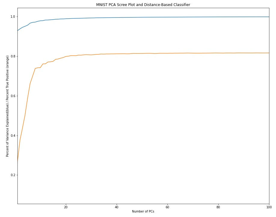
MNIST_train_pca_mean_value=pca_on_np_array(MNIST_train_images_linearized_normalized)The first bit of analysis I like to do after completing PCA is seeing how much variance is explained by each of the principal components. The resulting plot is referred to a a scree plot:
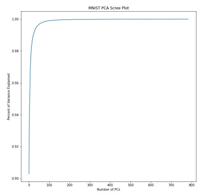
Here, I explicitly compute the number of PCs needed to explain a given amount of variance
#number of pcs it takes to achieve a variance cutoff
#cumulative variance explained

var_cutoff=.99

cum_var=1-((MNIST_train_pca_evals)     /     sum(MNIST_train_pca_evals))

for i in range(len(cum_var)):
    if cum_var[i]>var_cutoff:
        npcs_to_explain_var_cutoff=i
        break
print('It takes ' + str(npcs_to_explain_var_cutoff+1) + ' pcs to explain ' + str(var_cutoff*100) + '% of the variance')
#outputs
>>>It takes 1 pcs to explain 50.0% of the variance
>>>It takes 5 pcs to explain 95.0% of the variance
>>>It takes 23 pcs to explain 99.0% of the variance
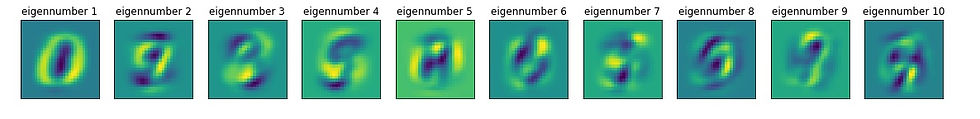
>>>It takes 101 pcs to explain 99.9% of the varianceWe can view the "new axes" by simply plotting the eigenvectors to create "eigen-numbers" (which would correspond to eigenfaces). Based on the output above, we'd say that the first eigen-number explains 50% of the variance in the data.
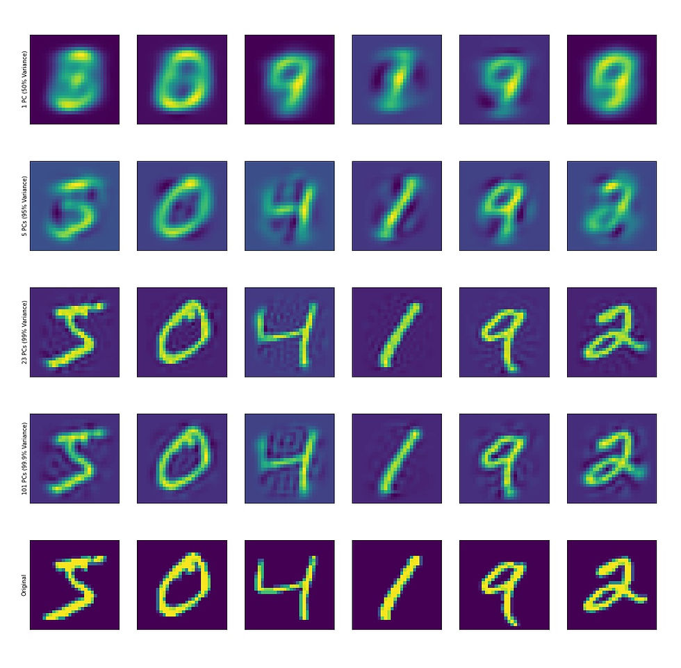
We can also visualize reconstructed digits using any number of PCs:
With the data represented as PCS, there are a few things one can do.
The first and obvious thing is the dimensionality reduction. If we feel comfortable with a lower dimensional representation of our data (for example, using 23 PCs we can capture 99 percent of the variance and clearly identify digits by eye). So instead of storing 784 dimensional images, we now store 23 dimensional PCS. If we build a simple classifier to call digits based on the euclidean distance between PCS, the performance plateaus around 20 PCs.


Intuitively, the ability to classify things based on principal component scores (PCS) tends to align with the amount of variance the principal components (PCs) explain
In addition to serving as a dimensionality reduction tool, PCA is also used as a clustering algorithm. How is the data distributed when covariance is minimized? If we plot just the first two PCS of each data point, we can actually see that like digits occupy similar spaces.
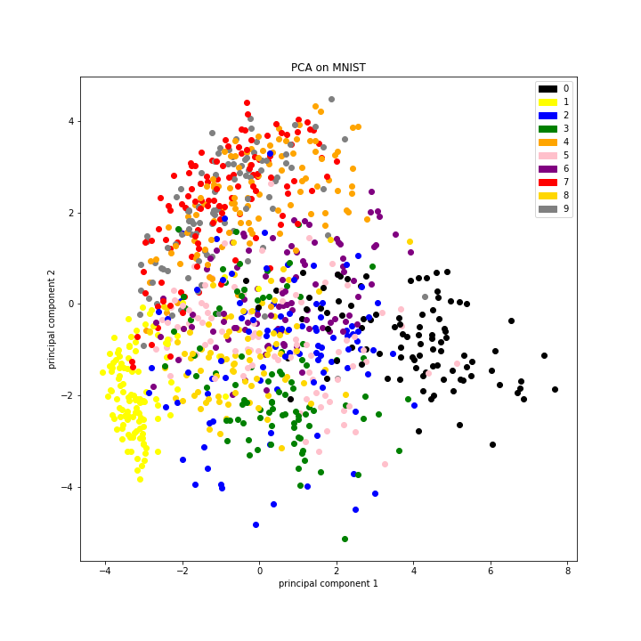
I cannot emphasize how "crude" this analysis is and yet the organization is clear. I think it's clear that "dimensionality reduction" is the tip of the iceberg when it comes to PCA; it is also useful for organizing data, for visualizing data, and as input for other types of downstream analyses.
The last thing I'd like to touch upon is a minute detail of PCA. Recall the function pca_on_np_array; there is a particular step in which the eigenvectors and eigenvalues are calculated via:
evals , evecs = LA.eigh(cov)This Scipy method utilizes the QR method for calculating the eigenvectors and eigenvalues of the covariance matrix. I toyed with the idea of writing out the algorthim but decided it would be unecessary for the initial understanding of PCA. The thing to know is that PCA's computational expensiveness comes for this very step, and learning how we reached the point of converging on THIS particular algorithm is worth exploring (in another post :p). There's a bunch of digging to be done and I suggest tinkering with toy examples. Here, I went right to images because that is the type of data I work with, but PCA works on just about any type of data. Get your data in a Numpy array and give it a go!
#imports for all code used in this post
import numpy as np
from scipy import linalg as LA
import itertools
import seaborn as sns
import matplotlib.pyplot as plt
import os
abra=os.getcwd()
import pickle
import scipy
import math
import matplotlib.patches as mpatches
#code credit: Rockwell Anyoha
-Rockwell
P.S. I'll try to post something at least once a week from here on out, but no guarantees it will be USEFUL

Comments